Of my daily reads, Michael Arrington’s TechCrunch is one I most enjoy. It’s an amazing look into the new ideas (some great, and some “not so much”) that people have for the web. Today I took special notice of Erick Shonfeld’s post about Google’s search tool: SearchMash. In part, I’m interested in anything “Google”, but this time I also found something a little fishy.
I drew that!
Back in 2000, when we started our firm, we created the smashLAB wordmark. It presented a few technical problems, including the marriage of two styles/cases, and an “h” with an awkward counter and a tricky ascender. I think we resolved the issues well by condensing that counter’s horizontal space, cranking the x-height on the lower-case glyphs and a few other tweaks.
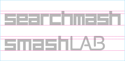
Speed ahead to today, and we find that Google’s SearchMash wordmark looks, well, pretty darned similar. Take a peek at the little comparison we generated this morning, and judge for yourself:

Perhaps this is a simple case of like-minds; however, the similarities are a little disconcerting. That name, the compound word and phonetics, the geometric forms, the x-height and cap height, the character weights and widths… I dunno… It just seems like someone at the Googleplex isn’t doing their own homework.
Now, I can live with this as a form of creative flattery; however, Google’s pretty good at getting their name out there. We, on the other hand, are a tiny little design firm. I have to wonder what happens when their new service becomes wildly popular. I fear that all of a sudden, we’ll look like hacks that copied them, when in fact… Well, you get the picture.
Change the code dummy
All of us find something that looks close to our work out there, but there are some examples that really make your jaw drop. That’s what happened when I inadvertently came upon “violin master” Jay Cayuca’s website.
smashLAB’s new website received a little recognition when it launched last spring. Clearly it caught Jay’s attention; he stripped the site, swapped the photos, and presented it as his own. Clearly not a stickler for detail, Jay failed to go to the trouble of removing our name from the source code. It was a simple Google search (they do make handy stuff, don’t they?) that led me to his site.
My email to Jay was a little catty. I simply noted, “We’re flattered that you like the smashLAB site, but you can’t just copy this. Please make your own site. Do you steal your music as well?”
I never did receive a response from Jay, but two days later he changed the links and source code sufficiently to not have his blunder seem quite as incriminating.
Artists and imitators
We all get inspiration from one place or another; my painting instructor Renee Van Halm used to tell us, “You can’t create in a vacuum.” As a result, I’m always looking. In my mind, designers have to assess and deconstruct as many perspectives, treatments and visual styles as possible, in order to effectively command a pluralistic approach in their work.
So, I might find a great type treatment, and work from it; or, I could uncover a particular photographic approach that lends itself well to a project. I don’t believe many would see this as anything other than good research and development of one’s visual literacy. There’s nothing wrong with being inspired by the works of others, but that doesn’t afford one license to steal it.
Over the years, I’ve seen a few sites that have been nearly identical to work we’ve designed for clients or ourselves. Although I sometimes send an email asking for these people to avoid copying our work, I’ve mostly come to accept this as a reality that is hardly worth much concern. That being said, a moment ago I visited Copyscape for a quick look about. Our search there brought me to a couple of sites that resulted in all of us at smashLAB actually laughing out loud.

Take a peek at Apriva Creative and Netsolo‘s sites. (Update: Both have been changed/deleted since this post first appeared.) I keep asking the same question, “What the fuck were they thinking?” I bet you’ll share this sentiment. (Interestingly, both of them have statements regarding intellectual property ownership.)
I’m not covering particularly new ground here. Many designers have had these “What the *&%$ ?” moments. As a connected world allows us to find all of these great creative ideas, it also affords less-scrupulous parties the opportunity to profiteer from our hard work.If nothing else, we should do our best to call out these incidents when we uncover them.
And to the folks at Google: If you’d like us to build a new logo for searchmash, just send me an email at: karj@smashlab.com. We’d love to lend a hand. ;-)
Friday, October 26th, 2007
Comments & Trackbacks

Pingback: When logos look alike | Logo Design Love